
The Science of Sight: Colors, Fonts, and the IBM Standard
A11Y Part 2
In our first article, we discussed the "Invisible 16%"—the billion-plus users who are often locked out of the web due to poor design. Today, we go inside the design studio to look at the most common barrier to entry: Visual Accessibility.
Designing for the eyes isn’t just about aesthetics; it’s about math, clarity, and understanding the medical reality of how different people perceive light and color.
1. The Math of Contrast: AA vs. AAA
Most designers know that light gray text on a white background is a "trend," but for millions of users, that trend makes a website invisible. To solve this, the Web Content Accessibility Guidelines (WCAG) use contrast ratios.
Level AA (The Standard): Requires a contrast ratio of at least 4.5:1 for normal text. This is the baseline to ensure users with moderate low vision can read your content.
Level AAA (The Gold Standard): Requires a ratio of 7:1. This makes your site incredibly crisp for everyone and is essential for higher-level inclusivity.
2. The IBM Standard: Palette Engineering
You don't have to guess if your colors work. Tech giants like IBM have turned accessibility into a science through their Carbon Design System. They utilize a "Color Grade" system (ranging from 10 to 100) where the numerical "step" between two colors mathematically guarantees their accessibility.
For Dark Backgrounds: Any color graded 60 or higher is safe to use with white text.
For Light Backgrounds: Any color graded 50 or lower is safe to use with black text.
By adopting a palette that accounts for this non-text contrast, you ensure that "actionable" elements like buttons, icons, and input borders are just as visible and functional as your primary headlines.
3. Beyond Color: Why a "Single Highlight" Fails
Color blindness affects roughly 1 in 12 men and 1 in 200 women. If your website uses only color to convey meaning then, many users won't see the difference. Example, a red border for an error or a green highlight for a "success" state
According to official WCAG Use of Color standards, color should never be the only messenger.
The Rule: Always pair color with a secondary cue, such as an icon, a text label, or an underline.

In the above image, the blog section (right) has a indication of links with the right arrow while the project section(left) becomes ambiguous for a person who can’t distinguish color (in simpler terms, no color).
I also want to point out that this is from my own site, that had an update a few days ago. As people, it is very easy for us to miss things.
A few minutes of our time to check for accessibility can easily help us recognize and fix them.
🛠️ The Designer’s Testing Toolkit
Before you finalize a design, test your assumptions with these simulators:
David Math Logic Palette Builder: Create a palette that is mathematically safe for color-blind users from the start.
Coblis Simulator: Upload your mockups to see exactly how they appear to someone with different types of color vision deficiency.
Jfly Color Palette: A master reference for a universal color set that is unambiguous to all.
4. Typography: More Than Just Style
A font can be "beautiful" but functionally broken. For users with dyslexia or low vision, certain typefaces are a maze.
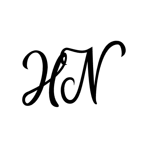
Avoid Decorative and Cursive Fonts
While cursive looks "premium," it is a nightmare for accessibility for two reasons:
Character Ambiguity: Cursive fonts often have "ligatures" (where letters join together). Example, for users with Dyslexia, it becomes impossible to distinguish where an 'm' ends and an 'n' begins in the word Alumni.
OCR Failures: Screen readers often struggle to decode stylized characters, sometimes misreading them as symbols or skipping them entirely.
See the Distropiax font for example on the word "Alumni"":
“l“ “u“ pair and “n“ “i“ pair is connected at the bottom seeming like a single letter
“m“ and “n“ are very similar
”a” seems more like a symbol/logo than a letter
These things also increase cognitive load.

Research by University of Michigan, USA found that font types have an impact on readability of people with dyslexia. Good fonts for people with dyslexia are Helvetica, Courier, Arial, Verdana, and CMU.
| Font styles that increased readability | sans serif, monospaced, and roman |
| Font styles that decreased readability | italic |
The "No Images of Text" Rule
Never "bake" your text into a .jpg or .png file. It creates a technical dead end:
Zero Scalability: When a user zooms in to 200%, a font rendered in CSS remains crisp. An image of text becomes a blurry, pixelated mess.
The Alt-Text Trap: Alt-Text isn't a substitute for real text. Users cannot select, copy, or highlight text inside an image. If they need to copy a coupon code from an image, they are stuck. Reference: W3C definition on images of text.
See the below images, at 125% zoom, it reaches maximum width of the screen and the text can no longer increase in size. The letters in the image have lost their sharpness while the plain takes still remains sharp.

Use Scalable Units (rem over px)
Stop using pixels (px) for font sizes. Using rem allows your text to scale based on the user's browser settings. If a user needs 24pt font to see, your site should "listen" to that preference rather than locking them into your design choice.
In the image below, all components have smoothly scaled even at 400% zoom.

Fonts to avoid
Low Contrast/Thin Strokes: Makes letters difficult to distinguish:
Crowded Lettering: Letters are too close together, causing them to blend. Example: Serif fonts like Times New Roman
Mirroring/Similarity: Letters that are too similar increase confusion. Example:
'b', 'd',
'p', 'q',
'l' (lowercase L), 'I' (Capital I), '1' (number one)

5. The Browser "Stress Test"
You can perform a DIY audit using the built-in tools in Firefox or Safari. Open your site and try to:
Increase the font size to 200%.
Force a change to a basic system font.
Check if your essential information remains readable.
If your layout overlaps or disappears, your design isn't truly accessible yet.
Coming Next: Part 3—The Developer’s Audit. We’ll get technical with the WAVE extension, BrowserStack, and the Firefox Accessibility Inspector.
This article was copyedited with Gemini.