

Stop Hacking Your Checkboxes: A Modern Approach
Learn to ditch the fragile, label*-based hacks. This guide details a modern, robust method using appearance: none, clip-path, and Grid to create custom checkboxes that are clean, scalable, and semantically* correct

Unpacking the “Fragile Hack”: Why the Old Way Fails
The standard method involves hiding the real <input> and using the <label>'s pseudo-elements to create the checkbox graphic. While it looks right, it's a house of cards built on three core failures:
1. Brittle Layouts and Styling
The hack forces the <label> to manage both its text and the checkbox graphic, leading to constant layout battles.
Manual Positioning: You’re forced to use
padding-lefton the label to make space, thenposition: absoluteto place the fake checkbox. This is brittle.Breaks with Dynamic Content: If the label text changes font size or wraps to a new line, the alignment of the checkbox graphic breaks. Fixing this requires even more complex CSS.

- Style Conflicts: A simple change to the label’s
line-heightordisplayproperty for other reasons can completely misalign your checkbox.
2. Compromised HTML Semantics
This hack violates the fundamental principle of separation of concerns.
- An Element Doing Two Jobs: A
<label>'s job is to describe an input. This hack forces it into a presentational role, making it both a label and a graphical button. This makes the code less intuitive and harder to debug.
3. Critical Accessibility Pitfalls
This is the most serious failure.
Forgotten Focus States: Styling focus states becomes a complex, multi-step process (
input:focus + label::before). This is frequently forgotten, resulting in components that provide no visual feedback for keyboard users—a major accessibility failure.Failure in High Contrast Mode: A checkmark created with
background-coloron a pseudo-element often disappears completely in Windows High Contrast Mode, making it impossible for users with vision impairments to see the checked state.By using the fragile hack, you lose maintainability, simplicity, and robustness. Your component becomes a chore to update and is guaranteed to fail in common edge cases.
Crafting a simpler, decoupled version

Step 1: Nuke the default style 💥
First, we remove the browser’s default styles with appearance: none. This gives us a blank canvas. We then style the <input> itself to be our box, using em units, so it scales with your text.
input[type="checkbox"] {
/*  reset browser styles  */
  appearance: none;
  -webkit-appearance: none;
  margin: 0;

/*  scale size according to font  */
  width: 1.2em;
  height: 1.2em;
  font-size: inherit;
}

Step 2: Create the base for the container and tick
input[type="checkbox"] {
  /* exisitng styles... */

  /* define the checkbox container */
  border: 0.15em solid #5a5a5a;
  border-radius: 0.3em;
}

input[type="checkbox"]::before {
  /* Setting the base for checkmark. */
  content: "";
  width: 80%;
  height: 80%;
  margin: auto;
}

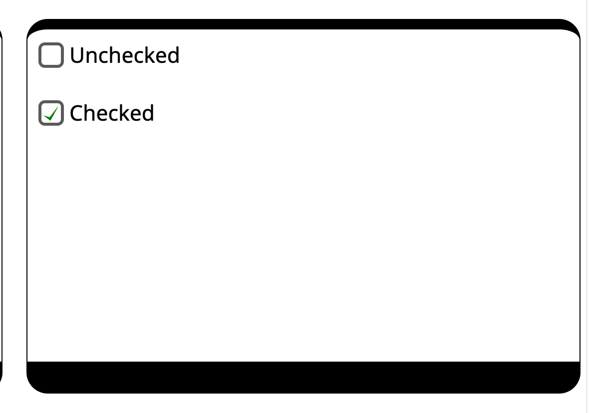
Defining checkbox container and tickmark base
Two things to notice here:
The label and the checkbox baselines are not aligned properly.
We can’t visualise the tick mark base.
Let’s add a background-color: limegreen; on the pseudo selector :before when :checked. We still can’t see the tick base. That is because it needs to be positioned on the UI. Traditionally, it was done using position: absolute;. In modern CSS, it can be done using grid.
input[type="checkbox"] {
  /* exisitng styles... */

  /* center position the tick */
  display: inline-grid;
  place-items: center;
}

input[type="checkbox"]::before {
  /* exisitng styles... */
}

input[type="checkbox"]:checked::before {
  background-color: limegreen;
}

Step 3: Drawing the tick
We use CSS property clip-path and polygon() function to draw are tick on the screen.
/* other existing styles */

input[type="checkbox"]:checked::before {
  background: limegreen;

  /*  drawing the tick mark as x,y points */
  clip-path: polygon(
    0% 65%,
    41% 77%,
    100% 0%,
    46% 100%
  );
}

Use polygon() and clip-path to define the tick mark.
For further enhancements, you can add border-color, background-color, and transform styles to the input when checked.

Step 4: Accessibility and other concerns
There is an issue with this. In Windows high-contrast mode, all the backgrounds are stripped. Only black and white remains. When this happens, our checked state will disappear.

Tick mark disappears in Windows high contrast mode (WHCM)
We can fix this using a neat CSS trick. When Windows forces black and white colours, we add a CSS media query to ensure the background picks the available system colours.
We have 2 options :
Highlight: This keyword maps to the system’s “selection” or “accent” colour (often blue by default).
CanvasText: This keyword maps to the default text color in the user’s OS theme. In a light high-contrast theme, it’s typically black. In a dark theme, it’s white.

@media (forced-colors: active) {
  input[type="checkbox"]:checked::before {
    background-color: Highlight;
  }
}
Similarly, handle accessibility for keyboard by styling :focus-visible for the input. And, the :disabled and :read-only states with cursor: not-allowed to give a clear idea to the user. We can also use the aria-checked HTML attribute for screen readers.
Step 5: Automating using CSS variables (optional)
Furthermore, we can use CSS variables to style the checklist based on the section background colours. This helps the checklist seamlessly blend with the flowing content.
For automating this, I use 80% of the current text colour as the background colour
/* keep existing value as fallback for older browsers*/
background: limegreen;
background-color: var(--checkbox-bg, rgb(from currentColor r g b / 80%));


Note that we haven’t touched the label element. We can now independently style it as a common component for all input types without worrying about disturbing the checkbox styles. This also helps maintain the semantic HTML structure.
Key Takeaways
✅ Use
appearance: noneon<input>to reset browser styles.❌ Don’t hide the input and style the
<label>.✅ Use
clip-pathandpolygonfor a clean checkmark shape.✅ Use
display: inline-gridfor centring.✅ Build for Scalability: Use
emunits for sizing so your checkbox scales with the surrounding text, and use CSS variables for easy theming.✅ Prioritise Accessibility: Always include a clear state for keyboard users. Use the
@media (forced-colors: active)query to provide an alternative style for Windows High Contrast Mode.✅ Avoid accidental shrinking: I prefer adding
flex-shrink:0;as a fail-safe in my input to avoid accidental shrinking in a possible flex parent. You might miss these if it only happens on smaller devices.

Image shows accidental shrinking in flex-parent, especially in mobile devices.
Over to You
I wrote this guide with an intention to provide a solid foundation for modern checkbox styling, giving you techniques you can carry forward into more advanced components.
But this is just my take, and I’m always eager to learn from the community. I’d love to hear your thoughts — did I miss anything? Have you run into a specific edge case where this might fail, or do you have a different technique you prefer? Accessibility concerns?
All suggestions and critiques are welcome in the comments below. Let’s learn from each other!